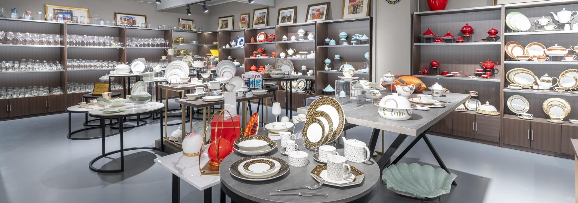
PITO Article
Understanding the Psychology Behind Plate Color in Dining
Plate color psychology plays a measurable role in shaping how diners perceive flavor, freshness, portion size, and emotional satisfaction. Across the hospitality industry, research increasingly shows that the color of a plate does more than frame a dish—it actively influences appetite, taste expectations, and the overall dining experience. For chefs and hotel operators, understanding these psychological mechanisms allows tableware to become a strategic design element, not merely a serving tool.
- Plate color also shapes the emotional connection diners form with their meal—affecting likability, comfort, and perceived quality. Subtle variations in hue can influence whether a dish feels indulgent, refreshing, sophisticated, or playful.
- One of the most significant mechanisms behind these effects is simultaneous color contrast, a visual phenomenon in which the surrounding color alters how the brain interprets the food’s color and, consequently, its taste and intensity.
By understanding these psychological principles, hospitality operators can select dinnerware that enhances presentation, strengthens brand identity, and elevates the guest experience. PITO’s color-focused porcelain collections incorporate these insights through controlled glaze development, tonal balance, and Horeca-grade design, supporting hotels, restaurants, and caterers in creating dining experiences that feel intentional and memorable.
Psychology Behind Plate Color
Color Perception and Appetite
Plate color plays a pivotal role in how diners perceive portion size, balance, and overall satiety. Studies in experimental psychology show that color contrast between food and its background significantly alters perception, influencing both appetite and consumption behavior. One commonly cited mechanism is the Delboeuf illusion, where similarities between food and plate color cause diners to underestimate portion size—leading to increased intake, particularly in commercial dining settings.
For operators, understanding these perceptual biases provides a practical framework for selecting plate colors that align with menu engineering goals, whether to enhance indulgence or guide portion awareness.
Professional Insight: Selecting plate colors with intentional contrast can help guests more accurately assess portion sizes—supporting both operational cost control and a more satisfying dining experience.
The following table summarizes key studies on how plate color affects perception and appetite:
| Study Title | Findings |
|---|---|
| The Delboeuf Illusion and Plate Size: The Effect on Portion Size Selection | Color contrast can amplify the Delboeuf illusion, influencing portion size selection. |
| Color-O-Rama: The Influence of Color on the Perception and Acceptability of Foods | Color affects sensory perceptions, including taste, altering expectations regarding food flavors. |
| The Effect of Plate Colour on Food Intake in Children | Preliminary findings indicate that children eat more when food is served on plates with low color contrast. |
This understanding allows chefs and operators to select colors that not only complement ingredients but also guide the emotional tone of the dining experience.
Research also demonstrates that plate color can influence perceived taste intensity—particularly among sensitive or selective diners. Studies indicate that snacks presented in red or blue bowls are often perceived as saltier, while reduced contrast between food and plate (such as tomato-based pasta served on red plates) can lead to higher consumption due to diminished portion visibility.
These findings reinforce the importance of evaluating both contrast and color–flavor associations when selecting dinnerware for commercial environments.
For hotels, restaurants, and catering groups, incorporating these psychological principles into tableware selection enhances both operational strategy and guest experience. P&T Royal Ware integrates these insights into its glaze development, color engineering, and shape design, offering operators a comprehensive palette of Horeca-grade options tailored to different dining concepts and menu profiles.
Mood and Taste Associations
Plate color influences not only appetite, but also emotional tone, perceived sophistication, and flavor expectations. The ambiance created by color selection can make a restaurant feel more energetic, calm, refined, or celebratory—all of which shape guest satisfaction and memory.
Below is an overview of how different hues commonly affect mood in hospitality environments:
| Plate Color | Mood Association | Description |
|---|---|---|
| Red | Stimulates appetite | Boosts attention and prepares senses for food |
| Blue | Calming and serene | Enhances taste and aroma, ideal for relaxation |
| Orange | Encourages conversation | Stimulates appetite and impulse |
| Yellow | Happiness and creativity | Associated with optimism and a cheerful atmosphere |
| Green | Fresh and healthy | Correlates with nature, creating a homey feel |
| Brown | Organic presence | Stimulates appetite and comfort |
| White/Black | Cleanliness and clarity | Accentuates dishes, focusing on food sophistication |
These psychological associations help operators design dining spaces that evoke intentional emotions.
- Blue tones establish a calming, restorative atmosphere—ideal for wellness retreats, spa restaurants, and serene dining concepts.
- Orange and warm hues encourage sociability and energy, supporting lively, communal, or interactive dining formats.
By aligning plate color with the desired emotional environment, hospitality venues can strengthen their brand identity and enhance the perceived value of the dining experience.
Taste perception is also shaped by plate color. Research shows that bright or contrasting backgrounds heighten perceived sweetness, richness, and aroma intensity, while darker plates often create a more dramatic, refined presentation. White plates, for example, tend to increase perceived sweetness in desserts, whereas black plates elevate visual contrast and sophistication.
When used strategically, these effects can enhance menu presentation, improve overall satisfaction scores, and support premium positioning in hospitality environments.
- Plate color affects perceived sweetness, intensity, and flavor balance.
- Color-rich or reactive-glaze plates enhance visual appeal and appetite.
- Higher contrast between food and plate improves portion visibility and perceived freshness.
Operators can elevate their dining environments by selecting plate colors that reinforce brand identity, menu positioning, and psychological impact. PITO supports this approach through customized glaze palettes, color-matched collections, reactive glaze development, and Horeca-grade porcelain formulations—allowing each venue to create a cohesive visual language tailored to its concept and clientele.
By integrating plate color psychology into tableware selection, hospitality businesses can create memorable, emotionally resonant dining experiences that strengthen guest loyalty and encourage repeat visits.
Effects of Plate Colors on Dining
Warm vs. Cool Colors
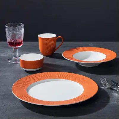
You can strategically select plate colors to influence guest appetite and dining satisfaction in commercial settings. Warm-toned plates—such as red, orange, and yellow—tend to stimulate appetite and convey a sense of vibrancy:
| Color | Effect on Appetite and Enjoyment |
|---|---|
| Red | Hightens emotional intensity and can increase consumption, making it effective for dynamic, high-energy dining concepts. |
| Orange | Evokes warmth and sociability, supporting communal or casual dining formats where interaction is encouraged. |
| Yellow | Enhances positivity and approachability, adding brightness to approachable menu items. |
Cool-toned plates—especially blue and green—create a calmer, more restorative atmosphere.
- Blue is linked to tranquility and appetite suppression, making it appropriate for wellness-focused venues, spa restaurants, or mindful dining concepts.
- Green reinforces cues of freshness and naturalness, enhancing the appeal of vegetable-forward, plant-based, and health-conscious menus.
These colors support venues that prioritize balance, nutrition, or a serene dining experience.
P&T Royal Ware offers a diverse palette of warm and cool plate options, allowing you to tailor the dining experience to your brand’s objectives.
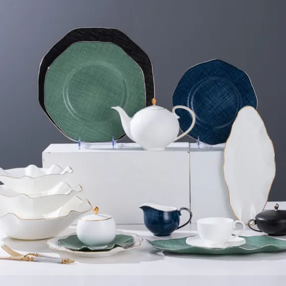
Light, Dark, and Neutral Plates
Light, dark, and neutral plates each play a unique role in food presentation and guest perception.
- Dark plates like black and navy enhance contrast and visual appeal but can sometimes make portions appear smaller.
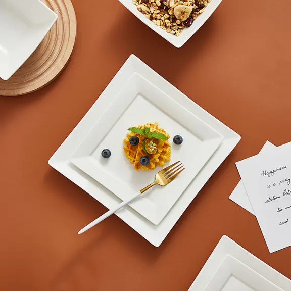
- Light-colored plates like white and beige enlarge the appearance of portions and highlight the colors of food.
- Neutral plates, such as black and gray, act as a blank canvas. They allow the colors of your culinary creations to take center stage, supporting a sophisticated and clean presentation.
P&T Royal Ware’s product range includes light, dark, and neutral plates, ensuring you can match your dinnerware to your restaurant’s concept and menu style.
Color Contrast and Food Perception
In professional dining environments, color psychology extends beyond hue to the contrast structure between food and plate. Tonal separation influences how flavors are anticipated, how portions are interpreted, and how precisely a dish communicates its culinary intent. High-contrast compositions reinforce visual clarity and heighten perceived intensity, subtly shaping consumption behavior.
Consistent findings show that desserts plated on white porcelain are often perceived as more delicate and sweeter—a reflection of how luminance contrast directs sensory expectation.
- Color establishes the first sensory cue and sets the emotional register for the dish.
- When the chromatic language of the plate diverges from the culinary narrative, flavor perception can shift, reducing harmony between visual and gustatory experience.
Through P&T Royal Ware’s Contrast Architecture—a design framework integrating tone, saturation, and glaze reflectivity—hospitality brands can curate plate collections that reinforce their identity and elevate the sensory coherence of the dining experience.
Special Considerations in Plate Color Selection
Picky Eaters and Sensory Sensitivities
In contemporary hospitality, plate color functions as a behavioral design tool—particularly in family-focused environments and sensory-aware dining spaces.For younger guests, color forms part of a motivational framework, guiding curiosity, acceptance, and balanced intake. Research from Cornell University shows that multi-color compositions naturally attract children’s attention and encourage exploration. When thoughtfully structured, colorful plate configurations can increase engagement and create a more inviting path toward diversified eating. These insights are particularly relevant for hotels, resorts, and family-oriented dining concepts seeking to enhance nutritional experiences while maintaining visual appeal.
Sensory-sensitive guests interpret color with heightened acuity, making chromatic decisions integral to comfort and inclusivity. You may encounter guests who experience physical discomfort or behavioral changes due to certain hues.
- Certain tones may induce visual strain or discomfort.
- Highly saturated colors can overwhelm the sensory field and disturb emotional equilibrium.
- Guests on the autism spectrum frequently favor low-saturation palettes—such as greens and earth tones—over vivid hues.
- Excessive chromatic stimulation has been associated with reduced comfort and shortened engagement periods.
P&T Royal Ware’s Adaptive Palette, featuring muted, sensory-friendly tones and tactile finishes, enables operators to design inclusive dining programs that respect diverse perceptual needs.
Restaurant and Cultural Preferences
In a global dining landscape, cultural aesthetics and brand identity converge to shape the emotional tone of hospitality environments. Plate color becomes an instrument of brand storytelling, reinforcing a restaurant’s conceptual framework and influencing guest sentiment. The following considerations highlight the strategic role of color in shaping commercial and experiential outcomes:
| Evidence | Explanation |
|---|---|
| Color as Behavioral Influence | Thoughtfully constructed palettes can encourage longer dwell times, higher engagement, and a deeper sense of comfort. |
| Color as Emotional Direction | Defining the emotion a brand seeks to evoke helps determine chromatic structure across the dining environment. |
| Color as Brand Integration | Consistency across menus, interiors, and tableware strengthens brand unity and elevates perceived value. |
Cultural aesthetics also determine how color is interpreted: in some regions, white signifies refinement; in others, saturated hues evoke festivity and abundance. In some regions, white plates symbolize purity and elegance, while in others, bold colors convey festivity or luxury. With a global design heritage, PITO employs a Regional Color Intelligence framework, offering palettes that honor local traditions while supporting international brand standards. When color psychology is embedded into design, dining becomes a multisensory experience—one that strengthens brand resonance and emotional recall.
Plate color selection operates as both an aesthetic element and an operational tool, shaping appetite cues, portion clarity, and guest confidence. You can achieve specific dining goals by choosing colors strategically. For example:
| Plate Color | Effect on Eating Behavior | Dining Goal |
|---|---|---|
| Blue | Appetite suppression | Reduce food intake |
| Green | Associated with health | Promote healthy eating |
| Darker | Enhances visibility | Improve portion control |
In professional kitchens, white porcelain remains the standard for expressive color contrast, while black and deep-toned glazes are used to cultivate drama and intimacy. PITO’s high-temperature porcelain glazes—engineered for Horeca durability and chromatic stability—allow operators to craft a coherent visual system that elevates both presentation and guest satisfaction.
LET'S TALK TOGETHER
Lorem ipsum dolor sit amet, consectetur estor adipi isicing elit, sed do eiusmod tempor este uterre incididui unt ut